Air France-KLM Design Framework

Facilitating the redesign of digital touch points

In this project we created a set of tools and guidelines that would allow multiple design teams and project teams work together on the redesign of the commercial digital touch points of Air France and KLM.

What I did

Workshop facilitation

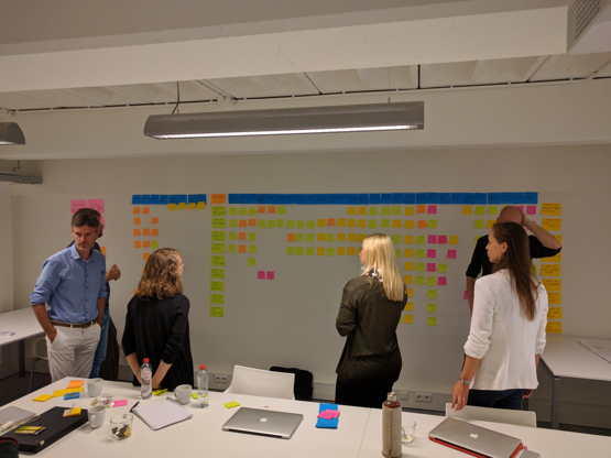
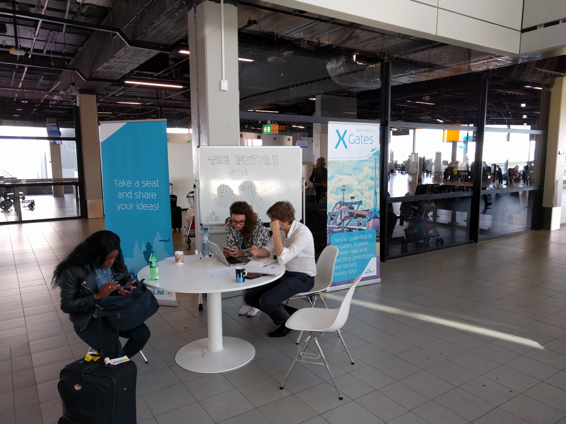
I facilitated workshops where we both presented to stakeholders, and collaborated with core team members.

Customer Journey Mapping

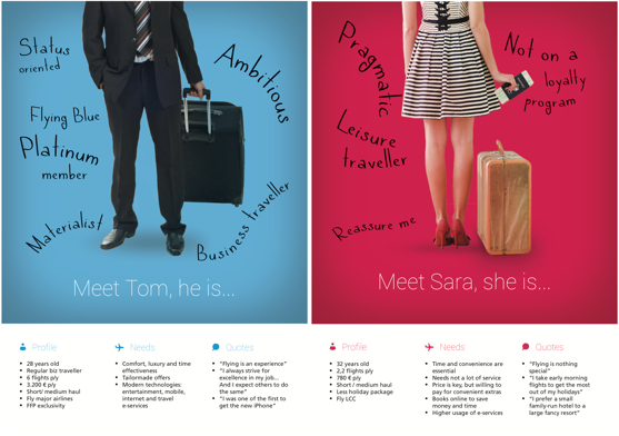
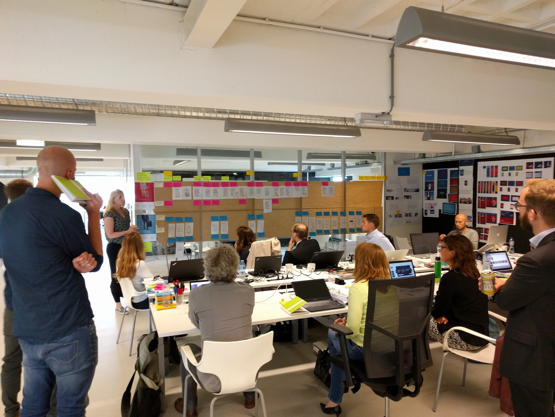
Based on the personas and analytics, we mapped out the customer journey and the accompanying needs, giving us a full overview of the project scope.

Concept Design

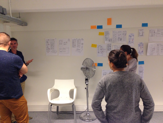
I created design concepts to cater to the identified needs, and convey possible solutions to the stakeholders and users.

Information Architecture

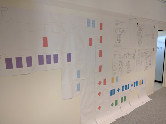
I mapped the online B2C ecosystem that allowed us to see how certain features were connected to each other.

For years, Air France and KLM have been partners in aviation, working together to bring passengers to their destination. Air France and KLM have been growing more and more into one company, integrating and converging each other’s services. One of the results of this synergy is the shared digital infrastructure. Both companies want to offer the same experience on the commercial digital touch points.

The business value

Aligning this experience would bring the two brand closer together, reduce technical overhead, and decrease development and maintenance costs of the digital touch points. This allows the organisation to adapt and optimise the digital touch points in a more lean manner, and focus on becoming Europe’s most customer-centric airline.

Value for the user

The current digital solutions fail to digitally empower the passenger, and put them in control of their trip. This gap in empowerment was caused by failing to inform, reassure, and guide the user in the necessary processes. The user needs that were identified, were not yet sufficiently fulfilled by the current digital platforms.

The Bigger Picture

We started out with a strategic track, which allowed us to lay out the UX and design principles, conduct the user modelling, and identify transversal features, requirements, and functionalities. This was necessary, since this strategic track helped us to establish the road map, and coordinate design teams in multiple locations.

The Problem

The current gaps in experience of both Air France and KLM’s digital touch points are due to the structure and way-of-working of both organisations. We aimed to provide a framework that would allow product teams to always start out from the same point of reference, and adhere to the same core principles. We would put this framework into practice by designing the key features of the customer journey ourselves. This was done by design teams in Paris and Amsterdam.

The Solution

To ensure alignment of different teams, we developed a set of comprehensive tools and guidelines, that would help these design and product teams to align with the overal design strategy and vision. We created the following tools:

  • Personas
  • UX & Brand Principles
  • Customer Journey
  • UX Patterns
  • Web Ecosystem Map

Personas

personas

We developed two personas that represented the two main contexts of both Air France and KLM’s target audience. These personas informed us about the needs that passengers want to have fulfilled, and goals they want to accomplish. Next to that, the personas specified the priorities of passengers in a given context, priorities such as cost, flexibility, and control.

UX and Brand principles

To bring the digital experience of both airline’s commercial touch points on par, we had to establish a set of guidelines that design teams would adhere to when designing new solutions. We needed both universal UX guidelines, and brand-specific guidelines.

The UX principles were defined bases on the needs that the personas had. We refined a broad set of principles by visualising possible ways of applying each principle. Making the definition of principles visual and tangible helped us to map the principles to the user needs, and end up with a selection of a few UX principles.

Both Air France and KLM already had their own brand principles, and here we added a crisp definition for each brand principle, accompanied by examples. This made the brand principles more understandable for both designers and non-designers, making it easier to adopt and adhere to these principles.

UX and brand principles

Customer Journey

We created a customer journey map of both personas we had identified earlier, and mapped the actions they went through when booking and managing flights, and the needs they have at each action. We could quickly identify gaps in the experience, and sketch out proposals to solve this. We would always check if the concepts we proposed adhered to the general UX principles. For example, one of the principles could be that we need to provide reassurance, and that persona #1 needed this the most. The biggest advantage of applying this visual overview was that we could maintain an overview, and consider previous and future steps and phases in the journey, as well as overlapping and recurring needs.

UX Patterns

When moving to the digital solutions, we needed to have a set of guidelines and patterns that would ensure consistency on all touchpoint. Since two teams would work in parallel on different solutions, we would run into the risk of them designing different solutions or patterns. To prevent this, we mapped out all the recurring tasks and patterns, such as logging in and a shopping cart. With this overview, we identified which team would need such pattern first, and we could put them in charge of creating an appropriate pattern, while taking into account the requirements the other team would have as well.

Web Ecosystem Site Map

To get an insight of how all the puzzles of the web ecosystem fit, I created a diagram plotting and connecting the various features and information. I did not went into page level detail, but remained on a higher level, visualising the features and user tasks. This diagram complemented all the other deliverables, visualising how all the features are connected with each other. We used this information mostly when identifying all the transversal tasks and UX patterns, and seeing which sections and features would be impacted by these patterns.

The result

We ended up with a high-level design framework, that allowed us to form the road map, distribute work between teams, verify that the proposed solutions fulfilled a user need, and maintain consistency between the design solutions.

Mapping components and patterns (x-axis) on user tasks (y-axis)

Discussing results of a sketching session

Conducting user tests at the departure gates of Schiphol airport

How to present a detailed site map to 10 people?

Discussing the Customer Journey Map in a kitchen review